

Background
CollegeBuys helps facilitate institutional purchasing agreements between major companies and California’s community colleges, allowing the colleges and their students to buy everything from computer systems to pens and notebooks at steep discounts. They host an annual conference that brings together college purchasing officers from across the state and provides them with opportunities for networking and professional development.
For the 2019 conference, the CollegeBuys team wanted to highlight the resources they can provide outside the scope of purchasing agreements, such as guidance for new accessibility requirements, or institutional connections at both the college and legislative level. College purchasing officers are often unfamiliar with these topics and want to know more, but are unaware that CollegeBuys can help them.
This graphic concept never made it to production, but it's still one of my favorites and serves as a great example of developing a creative insight into full applications.
Concept and Creative Strategy
We saw the challenge of this year's conference as a tension between certainty and uncertainty. Purchasing agreements are very cut and dry, while topics that are increasingly relevant, such as accessibility, are unknown and unclear to purchasing officers. This tension became the main visual inspiration for this concept.
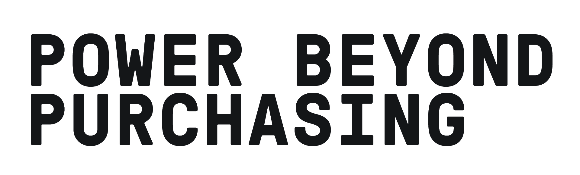
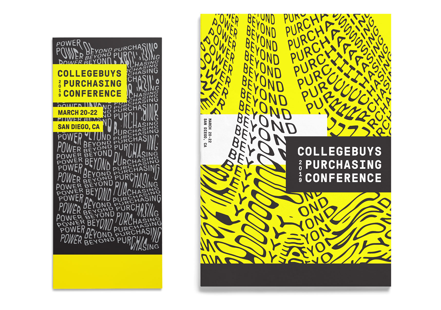
“Power Beyond Purchasing” was chosen as the conference theme, speaking to CollegeBuys’ capabilities outside of procurement agreements with a simple, strong statement. GT Pressura Mono was chosen as the main typeface for its confident and structured demeanor; a demeanor we then challenged by improperly scanning printouts of the conference theme.
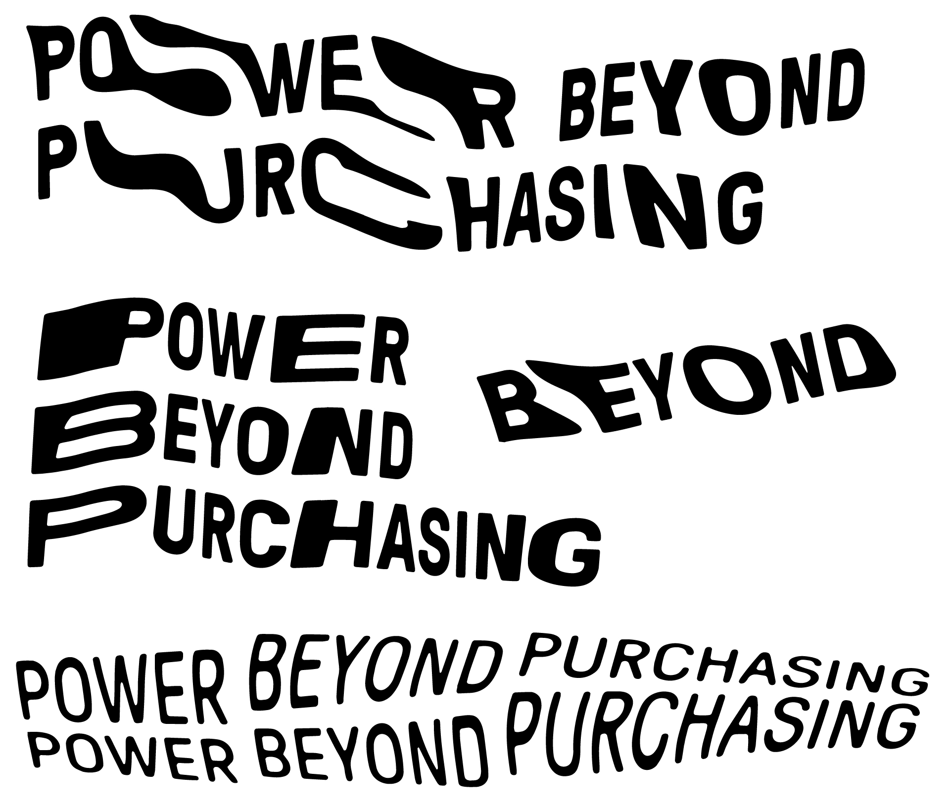
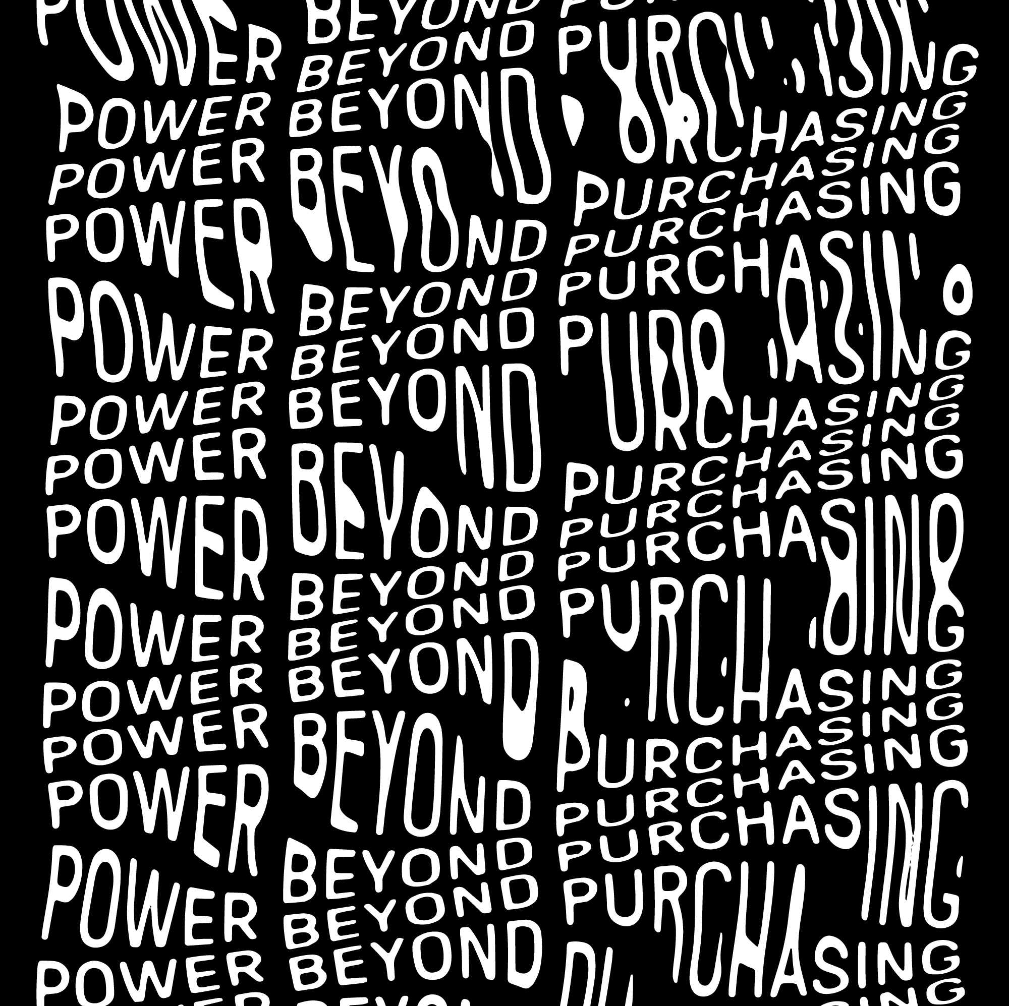
These distorted scans were brought back into Illustrator, cleaned up, and reassembled into wavy, undulating patterns and textures. These textures would serve as a background against which we could contrast stark, highly structured information panes.
Application
The applications follow the creative strategy, contrasting amorphous, undulating textures with rectilinear and structured areas. A striking bright yellow can serve to either highlight information or emphasize the overwhelming feel of some of the scanned textures; in both cases, it serves to amplify the contrast between the two.
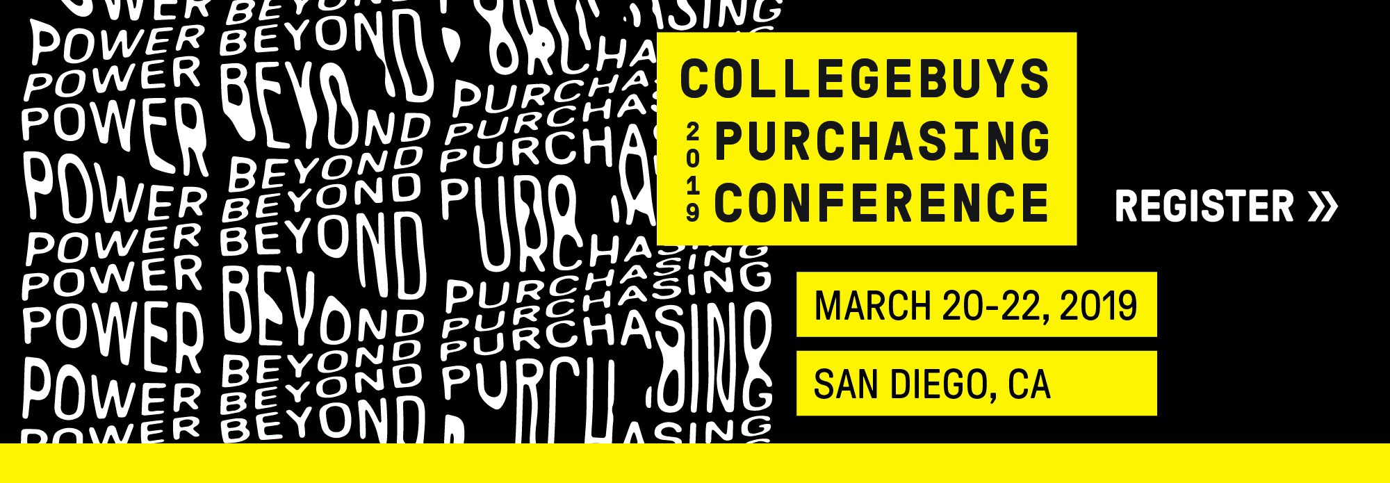
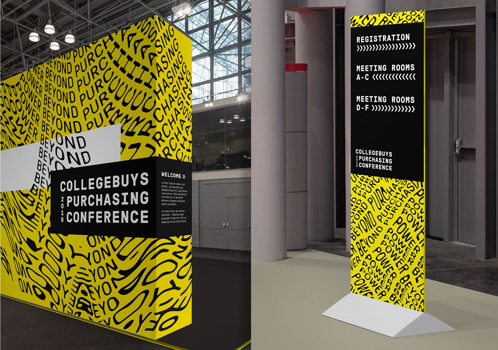
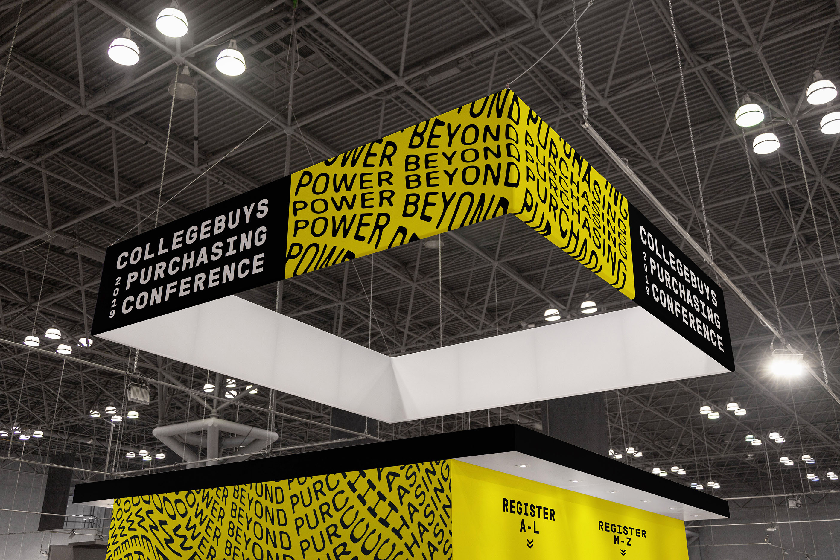
This concept was meant to beflexible and scalable, with the scanner distortion eventually being applied to other text such as session topics and event signage. The goal was to create a fluid identity system that would be different but familiar at each touchpoint, with the rigid grid system providing consistency across the ever-changing fluid background.